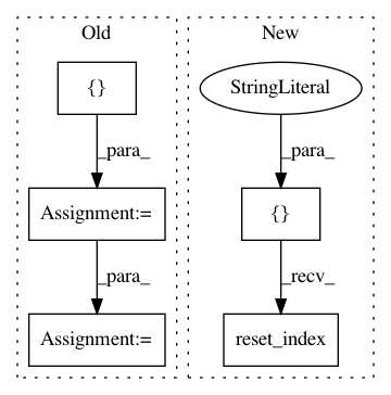
2f045e23607f4660d3920d6a91e322311516d6d6,examples/plotting/file/unemployment.py,,,#,8
Before Change
data["Year"] = [str(x) for x in data["Year"]]

years = list(data["Year"])
months = ["Jan", "Feb", "Mar", "Apr", "May", "Jun", "Jul", "Aug", "Sep", "Oct", "Nov", "Dec"]

data = data.set_index("Year")

// this is the colormap from the original NYTimes plot
colors = ["/�f", "//a5bab7", "//c9d9d3", "//e2e2e2", "//dfccce", "//ddb7b1", "//cc7878", "/묽b41", "/릾b1d"]
mapper = LinearColorMapper(palette=colors)
// Set up the data for plotting. We will need to have values for every
// pair of year/month names. Map the rate to a color.
month = []
year = []
color = []
rate = []
for y in years:
    for m in months:
        month.append(m)
        year.append(y)
        monthly_rate = data[m][y]
        rate.append(monthly_rate)

source = ColumnDataSource(
    data=dict(month=month, year=year, rate=rate)
)
After Change
months = list(data.columns)

// reshape to 1D array or rates with a month and year for each row.
df = pd.DataFrame(data.stack(), columns=["rate"]).reset_index()

// this is the colormap from the original NYTimes plot
colors = ["/�f", "//a5bab7", "//c9d9d3", "//e2e2e2", "//dfccce", "//ddb7b1", "//cc7878", "/묽b41", "/릾b1d"]
mapper = LinearColorMapper(palette=colors, low=df.rate.min(), high=df.rate.max())
In pattern: SUPERPATTERN
Frequency: 3
Non-data size: 5
Instances Project Name: bokeh/bokeh
Commit Name: 2f045e23607f4660d3920d6a91e322311516d6d6
Time: 2017-03-29
Author: jsignell@gmail.com
File Name: examples/plotting/file/unemployment.py
Class Name:
Method Name:
Project Name: catalyst-cooperative/pudl
Commit Name: fbd16b4f301f09b8868b60a4762700f3251e2cdc
Time: 2019-12-05
Author: zane.selvans@catalyst.coop
File Name: src/pudl/transform/ferc1.py
Class Name:
Method Name: plant_in_service
Project Name: etal/cnvkit
Commit Name: 1fe319ef49168c2c7c8d10a7c426c1414521d164
Time: 2016-10-28
Author: eric.talevich@gmail.com
File Name: cnvlib/tabio/genepred.py
Class Name:
Method Name: read_refflat
